Strengthen Bonds & Stay Connected Across the Miles with Loved Ones
UX RESEARCH · PRODUCT DESIGN

Revolutionizing Long-Distance Relationships Through Better Bonds
Long-distance relationships with loved ones can become strained over time due to decreased communication frequency, lack of physical affection, and inability to engage in shared activities. This can lead to weakened emotional bonds and a sense of disconnection.
The physical distance can negatively impact relationships over time. We created BetterBonds, a mobile application that aims to strengthen emotional connections between loved ones who live far apart. It was designed as part of a classroom project during my MS-HCI program at Indiana University.
MY ROLE
User Research
Ideation
Observations
Storyboarding
Prototyping
Usability Testing
TIMELINE
5-6 weeks
TEAM
Academic Project
(Collaborated with
3 Product designers
with shared roles)
TOOLS USED
INTRODUCTION
Overview of the problem
The emergence of social computing has drastically changed the way people interact and collaborate, especially during the pandemic when applications were developed to facilitate communication among those who were physically distanced.
In today's increasingly globalized world, many people find themselves living far away from their loved ones due to various circumstances. This physical distance can take a toll on relationships, making it difficult to maintain strong emotional bonds, understand each other's moods, and feel a sense of togetherness.
What is BetterBonds?
BetterBonds is an application designed to help maintain strong relationships between loved ones separated by physical distance. It facilitates more frequent communication through features like virtual gestures, mood tracking, shared calendars, chat rooms, and collaborative journaling. The goal is to foster affection, joy, support, and make sure distance does not diminish the bond between the loved ones.
Problem & Solution at a glance
THE PROBLEM
How might we create a platform that enables individuals to foster stronger emotional bonds and feel closer with friends and family who live far away?
THE SOLUTION
A platform that could strengthen emotional connections and to help loved ones stay connected despite physical distance.
KEY FEATURES
Main Features of BetterBonds App

01.
Mood Status
The app allows users to share their emotional state or mood with their loved ones on a daily basis. The loved ones can view the user's mood card and connect with them if needed to provide support.
02.
Reminder Touch
The app enables users to send virtual gestures like a poke, pat, kiss, or hug to their loved ones. The gestures spark conversations and indirectly strengthen bonds.

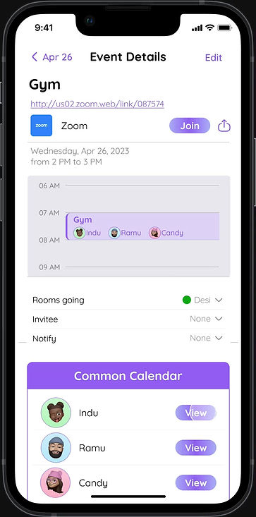
03.
Shared Calendar
Users can sync up calendars with loved ones. This makes scheduling video calls, virtual hangouts and coordinating daily activities easier. The app also ensures users stay up-to-date on what's happening in each other's lives
RESEARCH
The Design Process

Market Research
Through extensive market research, we examined applications like WhatsApp, Skype, Facebook, Instagram, LinkedIn, and Snapchat, as well as devices like touch lamps and bond touch bracelets, have successfully provided solutions to some of the challenges of long-distance relationships.
However, these technologies still lack the personal elements of in-person connections, such as physical touch, emotional support, real-time understanding of emotions, tracking of well-being, and work-life balance.

User Interviews & Field Observation
We conducted extensive user research including interviews with four participants, a questionnaire via WhatsApp, and both in-person and phone interviews. We focused mainly on International students. We also interviewed few family members of the International students to better understand the difficulties they are having when communicating with them.
The questions focused on challenges faced by individuals living far from loved ones, methods used to stay connected, and difficulties elderly individuals face using technology. We also asked about challenges with virtual meetings, such as building connections, efficiency of knowledge transfer, and problems with accents.
Key Insights from the Interviews

Key insights from the user research
We synthesized findings into an affinity map, which revealed the biggest user needs centered around strengthening emotional bonds, increasing feelings of physical connection, and enabling more seamless communication.

Affinity Mapping on Social Distancing Challenges
Goals & Objectives
After conducting market research and interviews, we have identified a significant opportunity to improve the emotional connections and bonding of individuals who live far from their loved ones. To achieve this goal, we aim to create a product or environment that is easily accessible and user-friendly, regardless of age or technological expertise.
Our solution will enable individuals to connect with their loved ones and indicate when they miss them, sparking conversations and rekindling old memories. We will also strive to help individuals understand their loved ones' moods and desires, providing emotional support and helping them stay informed about what's happening in each other's lives.
The Challenge
We uncovered key emotional and communication challenges faced by individuals separated from loved ones. Main issues included missing physical affection, struggling to interpret moods or emotions via virtual interactions, decreased communication over time, and difficulty staying updated on each other's lives. We aim to address these challenges in our design.
PROBLEM STATEMENT
How might we help users to strengthen relationships strained by physical separation from loved ones?
IDEATION
Brainstorming
We conducted several collaborative brainstorming sessions to come up with over 50 innovative ideas to address the challenges faced by individuals living far from loved ones. We documented and organized these ideas based on their shared technological requirements, their ability toaddress specific issues, and their similarity to existing platforms that lacked certain features. Then, we shortlisted ideas that were socially and technically feasible to implement.

Storyboarding
From our brainstorming sessions, We have developed the following two ideas that align closely with our ideology. For each idea, we created a scenario with unique features. These concepts were the result of both group brainstorming and individual brainstorming sessions.
Scenario 1
An app allowing friends to exchange virtual hugs/pokes and track daily moods.

Scenario 2
An AR app to teach older users how to use technology to stay connected.

DISCOVER
Deciding the Final Direction
After analysis, Scenario 1 was chosen for further prototyping as it better aligned with goals of facilitating activities and conversations to strengthen bonds among loved ones. It incorporates features like Reminder Touch for sending gestures, mood status updates, and shared calendars and interactive chat sessions.
The Idea
A mobile app that allows users to send virtual gestures, share mood status to their loved ones and maintain a sense of closeness even from a distance.
Building the User Flow
To ensure maximum accessibility of the app, we developed a comprehensive user flow. By doing so, we gained a better understanding of how users interact with the app and can identify potential pain points or areas for improvement.

DESIGN
Low Fidelity Paper Prototyping
Once we decided on which features to incorporate into the application and created the user flow, we created paper prototype to visualize preliminary app layouts, flows, and key screens. This enabled us to gather early feedback on our ideas before investing time in higher fidelity designs. We rapidly sketched wireframes showing core tasks like sending a virtual gesture, mood tracking, planning an event on the calendar, and reacting to a journal post.
We conducted think-aloud usability testing sessions where participants walked through key tasks while verbalizing their thoughts. This revealed valuable insights into points of confusion in the navigation and flows. Testing the paper prototype saved time and allowed us to iterate rapidly for the high fidelity.

My People Screen – Rooms screen – Chat screen

Profile Screen – Gesture Screen – Add Mood Screen

Profile Screen – Gesture Screen – Add Mood Screen

Avatar Creation Screens

Home Screen – Calendar screen – Create Ground Screen
Internal Walkthrough
We performed cognitive walkthrough with team members roleplaying as users. We simulated how people would move through key tasks, uncovering any potential pain points or areas of uncertainty. The walkthrough focused on assessing factors like whether users could determine next steps and knew they were making progress.
The first walkthrough looked at updating mood and creating a calendar event. It revealed issues like separate username/password pages confusing users and lack of confirmation after adding a mood causing uncertainty. The second walkthrough focused on viewing a friend's mood and sending gestures. Additional problems like difficulty adding people to calendar events and the profile screen design not matching expectations were found.
By conducting these cognitive walkthroughs on the paper prototypes enabled us to identify and resolve major pain points early on. The internal reviews provided valuable insights that led to design iterations improving user experience before users actually evaluated the interfaces.
Final Design

Experience the Prototype
Please click anywhere to begin interacting :)
Link to Full Figma Prototype Here!
TESTING
Product Evaluation
We conducted think-aloud sessions with 4 participants to evaluate our high-fidelity interactive prototype. Each person was moderated through a series of 10 tasks that allowed them to experience key features like sending gestures, viewing mood boards, and syncing calendars.
After testing, they answered interview questions to gather feedback on enjoyment, ease of use, areas of confusion and desired improvements. We measured task success rates and completion times.
The tests uncovered minor terminology confusion like around the term "grounds". The gesture and mood features were highly praised. Some navigation and iconography issues related to information hierarchy were also identified.
Findings from Testing
LEARNABILITY ISSUES
-
Confusion around terminologies
-
Need for tutorials, walkthroughs
-
Unclear labeling and synchronization of calendar
-
Lengthy and complex signup flow
COMPLEXITY & OVERWHELMING ISSUES
-
Numerous features may be overwhelming for some users
-
Gesture sending process needs simplification
- Journaling feature less intuitive and enjoyable
VISIBILITY & ACCESSIBILITY ISSUES
-
Low contrast on bottom navigation bar
-
Lack of confirmations when adding mood
-
Uncertainty where to click/navigate in some areas
POSITIVE FEEDBACK
-
Appealing visual design and animations
-
Useful potential of gestures and mood features
-
Recognized ability to facilitate connections
KEY LEARNINGS
Learnings
This project provided me many valuable takeaways that informed our design process:
-
Conducting extensive user research like interviews and surveys enabled me to truly understand pain points faced by our target users. This empathy-building phase informed the solutions we designed.
-
I learned the value of paper prototyping. Creating rough sketches on paper, let us quickly iterate on ideas and get early feedback before investing time in high-fidelity designs.
-
Usability testing was eye-opening. Watching users struggle at certain points revealed issues I had never considered. Getting real user perspectives is invaluable.
-
If I could redo this project, I would spend more time on the research and testing phases. These human-centric process helps to create solutions that truly resonate with people's needs.
On the constraints front, the major ones we faced included timeline limitations and remote collaboration difficulties. Having more time could have allowed us to research and evaluate more concepts in depth.
Reflections
Looking back, I am proud of the final prototype our team was able to produce within the timeline. I personally found conducting user research most satisfying as it helped us create solutions catered to real problems. The areas I want to improve on include becoming more skilled at creating intuitive but visually pleasing interfaces and asking better interview questions.
Testing revealed how much I still need to learn about design principles! My key realization is that designing solutions for people requires deeply understanding their needs first. I'm looking forward to applying these lessons to future UX projects.